
Surprising fact: oversized, visual-first books sell as keepsakes and can boost a photographer’s portfolio income by over 40% in some markets.
You are about to see why a physical, display-ready book still outperforms scrolling galleries for impact and memory. This short intro maps the value of a curated, hardcover volume that invites browsing rather than linear reading.
A coffee table book centers images and layout. It creates a tactile narrative that social feeds cannot match. For creatives and families, this is both a career tool and an heirloom.
Throughout this guide you’ll get a clear overview of the process: purpose, curation, layout, typography, color setup, print, and distribution. Each page choice will tie creative intent to production reality so you can plan with confidence.
Key Takeaways
- Understand what makes a display-ready, visual-first book effective.
- Learn core stages from concept through print-ready files.
- See how layout and sequencing boost photography and images.
- Preview tools like grids, master pages, and proof copies.
- Recognize format choices that shape reader experience.
What a Coffee Table Book Is and Why You Should Create One
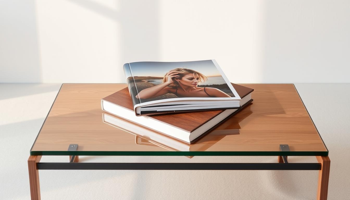
An oversized, display-ready volume turns photographs into a tactile centerpiece in any room. These hardcover pieces are built for browsing, not linear reading, and they put scale and finish ahead of dense text.
Defining the format:
Defining the format: oversized, visual-first, display-ready
This book format favors full-bleed spreads, thoughtful sequencing, and premium materials. It gives your photos room to breathe and your design choices weight on the shelf.
Benefits for photographers, designers, and brands
For photographers and designers, a long-view product works as a portfolio and a salable piece. Brands use these volumes in lobbies and client areas to signal taste and capability.
Heirloom value and identity display in your space
“People strategically display books as identity markers,” — Dr. Paul Harris
That identity display explains why well-made table books become heirlooms. They invite casual attention, reflect your aesthetic, and keep delivering value as tactile content and passive marketing.
- Portfolio credibility: sells your work as an object.
- Conversation starter: attracts clients and guests.
- Longevity: built quality endures over time.
Choose Your Purpose, Audience, and Theme
Identify the core aim for this project early. That decision steers every design and production choice, from image selection to paper stock.
Clarify your goal:
- Portfolio: emphasize range and consistency of your photography and work.
- Salable product: plan production costs, pricing, and broader appeal.
- Personal story: favor sequence and emotional pacing over commercial polish.
Profile who will hold this book
Define the people you imagine—clients, collectors, family, or fans. Match tone, pace, and visual style to their tastes.
Pick a sustaining theme
Choose a theme that supports a narrative arc and sparks conversation. Test your idea with a small mood board: color swatches, typography samples, and three sample spreads.
Translate concept into format choices: larger trim sizes suit detailed photography, premium paper lifts perceived value, and simpler builds lower costs for wider distribution.

Plan Where It Lives: Context, First Impressions, and Use Cases
Where your volume sits changes how people discover and remember its pages. Think beyond content: the room, surface, and traffic patterns decide which spread becomes the first impression.
Display locations matter. In a living room, the table book should feel personal and tactile. In a studio or lobby, the same book must read like a portfolio or lookbook at a glance.
Business use is subtle but powerful. A custom coffee table book placed in a client lounge can serve as thought leadership and spark conversations that lead to work.

Where people will see it
- Home: warm narratives and personal stories that invite slow browsing.
- Studio: case studies, client work, and process images that sell services.
- Lobby or client lounge: high-traffic formats built for quick impact and repeat handling.
Design and distribution considerations
Plan for non-linear browsing by crafting spreads that read independently. Use bold hooks, clear hierarchy, and durable materials so a custom coffee table withstands frequent handling.
“Placement often matters more than content on first glance.”
Finally, add clear follow-up cues—QR codes, your website, or social media handles—so a casual flip turns into a lasting connection.
Curate Compelling Content That Tells a Story
Start by selecting visuals that carry emotional weight and align with your theme. Gather broadly, then pare down to the strongest images that advance your narrative.
Select high-resolution images and artwork. Prioritize technical quality: sharp focus, correct exposure, and 300 dpi files sized to your final page. Confirm printer specs and color profiles early.

Sequence for flow: beginnings, middles, and endings
Plan a clear arc. Use color, tone, and rhythm to link pages from opening through climax to close.
Balance variety: close-ups, wides, color, and black & white
Mix scale and style for visual rhythm. Pair hero spreads with clustered details and add short, purposeful captions that give context without overwhelming the imagery.
“Edit ruthlessly; remove anything that weakens the whole.”
- Compile a broad pool, then curate with intent.
- Make sure files meet print specs and look premium in print.
- Sequence images to craft emotional pacing and visual variety.
Page Count, Binding, and Structure That Support Your Content
Page count and binding set the physical rules your creative choices must follow. Start by choosing a realistic number of pages based on content depth and budget. Smaller coffee table books often begin near 28 pages, and most printers require totals in multiples of four.
Divisibility matters: saddle stitch requires pages divisible by four. Perfect binding normally needs an even page count and enough spine thickness for glue. Layflat options help when seamless spreads are part of your visual plan.

Structure, readability, and handling
Think of sections and chapters as part of the browsing experience. Clear transitions and signature planning make pagination simple and predictable for printing.
Paper weight, thickness, and binding choice all affect spread behavior and long-term quality. Heavier schedules can add bulk that strains the spine if the binding is incompatible.
- Plan signatures and export pages to match printer imposition.
- Choose cover treatment—casewrap, dust jacket, or image wrap—based on durability and visual goals.
- Confirm printing constraints with your vendor before final export.
| Binding option | Best for | Page constraints | Key advantage |
|---|---|---|---|
| Perfect binding | Mid-size books and higher page counts | Even pages; spine thickness needed | Clean spine and professional look |
| Saddle stitch | Thin, economical runs | Divisible by four | Low cost and flat lay for small runs |
| Layflat | Photo spreads and panoramic images | Varies; often costlier | Uninterrupted spreads for visual impact |
| Hardcover (casewrap) | Durability and premium display | Works with many bindings; increases bulk | Longevity and shelf presence |
Format, Size, and Orientation Choices That Fit Your Vision
The trim size and layout decide how each spread reads and how your work shows up on a shelf.
Orientation affects subject emphasis. Landscape suits cinematic shots and wide panoramas. Portrait favors people, editorial layouts, and reading flow. Square gives balance for mixed content and social-friendly framing.
Landscape vs. portrait vs. square for different subjects
Pick the orientation that keeps your strongest images intact and avoids awkward cropping.
Paper stocks, durability, and tactile quality
Evaluate surface options—matte, silk, or gloss—for contrast and feel. Higher-end stocks boost image clarity but raise costs. Economical stock can support a lo-fi look and improve unit margins.

When to go premium vs. economical for your audience
Choose premium materials for collector markets and gallery sales. Opt for economical finishes when you need broader distribution or lower per-unit pricing.
“Format choices should match how people will handle and display the book.”
- Orientation—match content: landscape for panoramas, portrait for people, square for variety.
- Paper—balance durability, finish, and color fidelity.
- Format—consider shipping weight, shelf presence, and production cost.
- Pages—set page size to avoid heavy cropping and keep type readable.
| Choice | Best for | Cost impact | Key effect |
|---|---|---|---|
| Landscape | Panoramas, cinematic photos | Neutral | Shows wide compositions without cropping |
| Portrait | People, editorial text | Neutral | Feels natural for reading and portraits |
| Square | Mixed content, balanced layouts | Neutral | Flexible for social and print |
| Premium paper & hardcover | Collector and gallery sales | High | Elevates perceived quality and longevity |
Design Your Layouts With Grids, Whitespace, and Rhythm
Start layout work by setting a clear grid that ties every spread together. You’ll create a baseline grid and column structure that keeps alignment precise across each page.
Use master pages to automate folios, headers, and margins. This saves time and reduces errors when you export final files. Make alignment rules for typography and image frames so the whole book feels cohesive.
Treat whitespace as an active design element. Empty space guides attention and gives key images room to breathe. Alternate airy spreads with denser layouts to keep the reader engaged without fatigue.
Mix full-bleed hero spreads with multi-image sequences to build rhythm and tell story beats. Respect safe areas so captions and important details stay clear of the trim and gutter.
- Keep column rules consistent across signatures.
- Align type baseline and image edges to the grid.
- Iterate with thumbnails, then refine into polished layouts.
“A clear grid makes complex layouts feel effortless.”
Typography, Captions, and Supporting Text That Enhance Images
Good typography acts like a silent curator: it guides the eye and frames each spread without shouting. Choose two complementary type families—one for display titles and one for body and captions. This keeps the design consistent and makes each page predictable for the reader.
Establish a clear hierarchy: set sizes for title, subtitle, body, and caption. Keep spacing consistent across pages and align type to your grid so captions sit comfortably near images.
Write short captions that answer what, where, and who. Use brief introductions or quotes to frame sections and help readers tell story beats as they flip pages.
Edit ruthlessly: remove jargon, trim excess lines, and proof for punctuation and typography details like smart quotes and en/em dashes. Place text away from gutters and busy image areas and check color contrast for legibility in print.
Color Management, Resolution, and File Setup for Print
Accurate color and file setup decide whether your spreads print with the impact you expect. Treat this step as part of your final design routine so the book reads the same on press as it does on screen.
DPI, color profiles, bleed, and margins
Choose high-resolution images at roughly 300 dpi at final size to preserve detail and avoid pixelation. Confirm this with your printer before final export.
Set the document profile to the vendor’s preferred color space—often CMYK—and keep all linked files consistent. Define bleed (usually a few millimeters) and safe margins so full-bleed spreads and type stay clear of trim.
Exporting a print‑ready PDF
Use master pages for folios, margins, and consistent layout across pages. Export a press-ready PDF with embedded fonts, correct compression, and the printer’s color settings.
- Prepare images at ~300 dpi at final dimensions.
- Set color profiles to CMYK per spec and check linked files.
- Define bleed and safe areas to avoid trim loss.
- Embed fonts and use appropriate compression to prevent artifacts.
- Order a printed proof and compare soft proofs for RGB-to-CMYK shifts.
“Order a physical proof—paper and ink behavior reveal issues digital previews miss.”
Document final specs—dimensions, page count, binding, paper, inks—so future reprints match the approved proof. This reduces risk and preserves the book’s print quality and consistency across runs.
How To Make Coffee Table Book: A Step‑By‑Step Guide To Designing Your Own
Begin by locking a clear visual direction that will guide every choice from image selection to cover finish. Use a compact mood board and a short creative brief so decisions stay focused and fast.
Conceptualize and mood board your direction
Define tone and pace. Pin color swatches, reference spreads, and a few type samples. This keeps the process consistent across pages and during proofs.
Gather, edit, and sequence visuals
Import photos, rate them, then shortlist images that support an arc: beginning, middle, end. Aim for technical quality and narrative fit.
Build layouts and refine typography
Use a consistent grid and master pages. Set styles for titles, captions, and pull quotes so typography feels intentional.
Add text elements, then proof and iterate
Write lean captions and place type away from gutters. Export a print-ready PDF to printer specs and order a proof. Take feedback, refine pacing, and lock final production specs.
“Proofs reveal what screen previews hide.”
| Action | Deliverable | Estimated time | Risk/benefit |
|---|---|---|---|
| Mood board | Reference sheet | 1–2 days | Low risk; defines direction |
| Image edit | Shortlist of images | 2–4 days | High benefit; tightens narrative |
| Layout & type | Master pages & spreads | 3–5 days | Improves consistency; moderate time |
| Proof & finalize | Printed proof, specs | 1–2 weeks | Reduces print errors; essential |
Choose Your Printing and Publishing Path
Deciding where and how you print affects cost, timing, and final quality. Your choice should match expected sales, distribution channels, and the visual standard you want for the photo book.
Digital vs. offset
Digital vs. offset: quality, quantity, and per‑unit costs
Digital printing suits short runs and fast turnaround. It lets you print under 100 copies without long setup fees.
Offset printing delivers consistent color and lower per unit pricing at scale. Many specialty houses set offset minimums near 500 copies and can handle 10,000+ runs.
Paper, cover, and finishing options that match your brand
Choose paper weight and surface—matte, silk, or gloss—based on image tone and handling. Pick cover styles like hardcover casewrap, dust jacket, or softcover.
Finishes such as foil stamping, spot UV, and lamination change perceived value and durability. Request paper dummies and printed samples before committing.
Working with specialty printers and distribution channels
Confirm a printer’s minimum quantity, color management approach, and lead times. Ask for device profiles and a sample proof to protect image fidelity.
Distribution can be direct sales, marketplace platforms like Amazon, or curated bookstore placement. Align storage, shipping, and pricing with projected quantity and audience demand.
“Order printed samples and a paper dummy — feel and ink behavior reveal what screens cannot.”
| Choice | Best for | Typical minimum | Key impact |
|---|---|---|---|
| Digital printing | Short runs, proofs | 1–100 copies | Fast turnaround, higher per unit cost |
| Offset printing | Large runs, gallery sales | ~500 copies | Lower per unit cost, superior consistency |
| Print-on-demand | Long-tail sales, online stores | None (per order) | Low inventory risk, higher retail margin flexibility |
| Specialty photo lab | High-qualification photo book | Varies by vendor | Premium materials and color management |
Assemble a clear production brief with final specs: page count, trim size, color profile, paper stock, cover type, binding, and quantity. This helps printers quote accurately and sets expectations for delivery and cost per unit.
Proofing, Budgeting, Pricing, and Distribution Strategy
Before you commit to a full run, print a single, full‑spec proof and examine every spread under consistent light. A physical proof shows color shifts, bleed issues, and font inconsistencies that screens hide.
Solicit external feedback. Share the proof with peers, a professional editor, and a sample reader. Ask them to flag image density, whitespace, and pacing so you catch blind spots early.
Estimate costs and set pricing
Build a clear budget covering paper, printing, binding, freight, warehousing, and distribution fees. Benchmark similar titles in retail and publishing marketplaces.
- Calculate unit costs and then add margins for retail and wholesale.
- Use benchmarks to set competitive pricing while protecting profit.
- Plan quantity around demand forecasts, storage, and cash flow.
Marketing, cover design, and placements
Refine your cover and title for maximum discoverability—this first impression drives buyer interest. Pair that with social media teasers, behind‑the‑scenes posts, and influencer outreach to amplify reach.
“A strong cover plus consistent promotion shortens the time between launch and sales.”
Finally, coordinate placements: galleries, boutiques, studios, and online storefronts reach different buyers. Align quantity and pricing with those channels so your project stays sustainable and the quality matches expectations.
Conclusion
Finish by aligning narrative decisions with the checkpoints that protect your printed work.
A well-made book pairs storytelling, visual craft, and production standards so your images live as an object people return to. Define purpose, gather 300 dpi files, design with clear grids and whitespace, and set color and bleed before export.
Proof a full sample, confirm size and pages, then pick the right printing path for quality and budget. This process turns creative direction into a tangible project that reflects your work and endures over time.
Next steps: finalize assets, request quotes, order proofs, and launch with a clear plan. You’ll leave with a practical roadmap that links vision, technical checks, and distribution so future projects run smoother and sell better.